




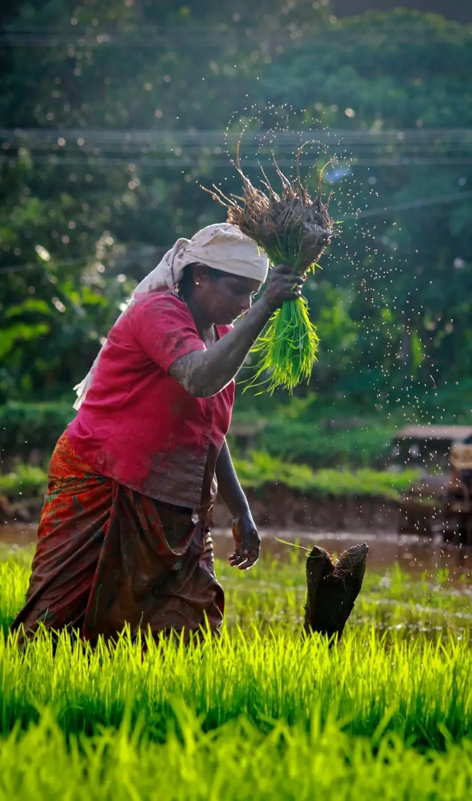


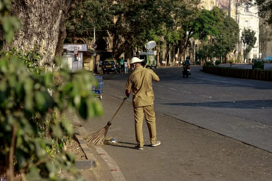
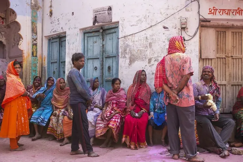
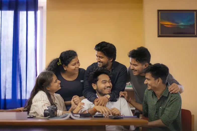









31 dots on one ring. The open side faces right, so the ring is never a closed circle: it is a channel with a way out.
brand guide
The mark is made only of dots in two sizes. Read it large and it is two rings, one inside the other. Read it small and it is a C. Nothing in it is a gradient, an effect or a picture of anything: it is one idea about movement, drawn twice.
Where it comes from: a river.



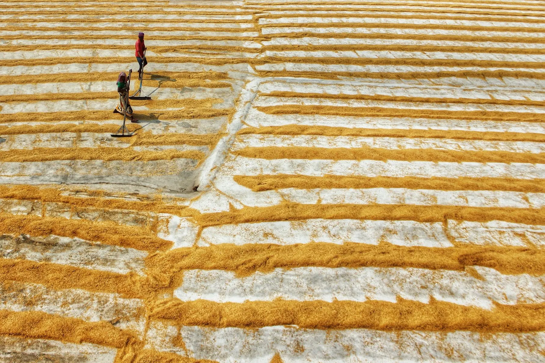
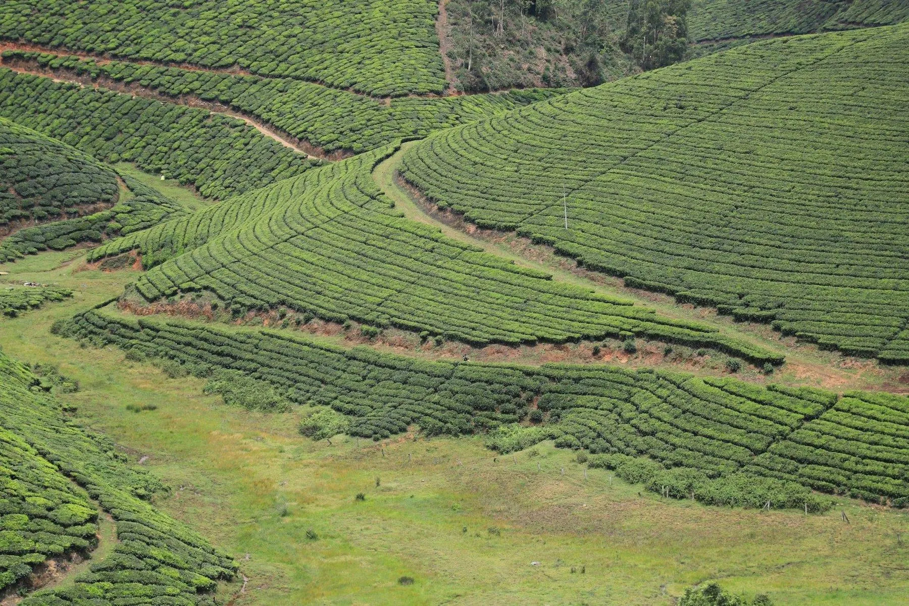 Common roots, shared current, always flourishing forward.
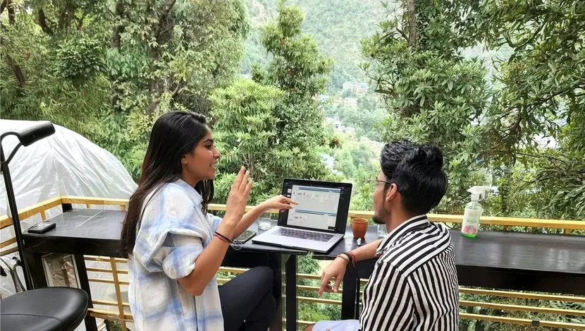
A river does not argue with the land. It finds the way through and leaves a route behind it.
What moves through a place long enough changes its shape. Programmes do the same to a system.
Water that stops becomes still. The work has to keep moving to stay useful.
A commons is what many hands can draw from without asking permission first.
Everything downstream of a current grows. That is the only measure that counts.
Platform Commons, carried forward.
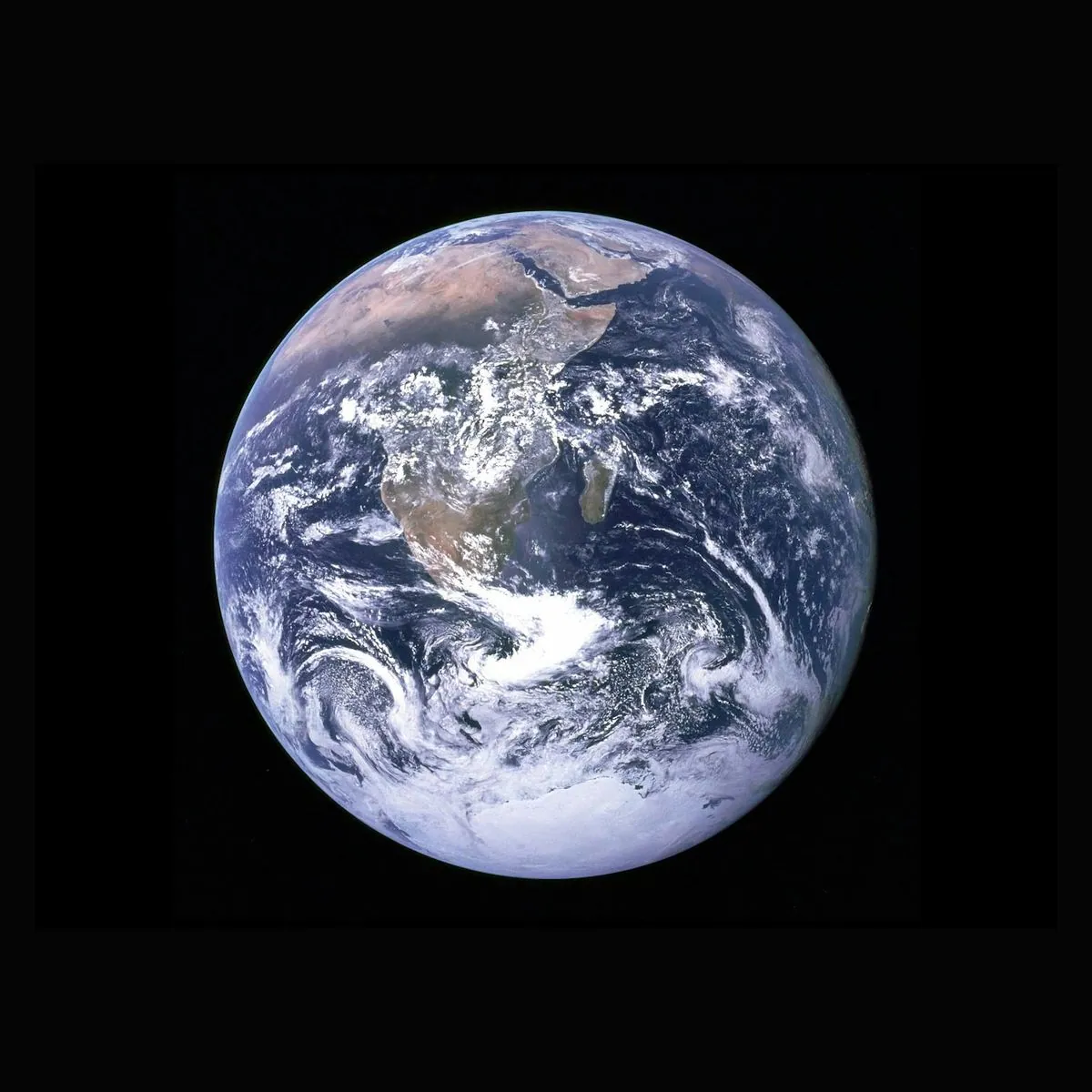
The whole world,
held as a commons.
Lay the mark over the Earth and its outer ring finds the edge of the world. Every sunrise any of us has seen rests on that line.
The Earth never stops turning, and neither do we. The dots flow the way the planet moves, carrying people, business and society forward.
Each dot is a life. One brightens, then the next, until the whole world glows a little warmer than we found it.
From the first question to the last mile.
The decision the programme actually turns on, taken early and written down, so the next year is not spent rediscovering it.
Field teams, frontline workers and the people a programme serves shape what gets made, before it gets made.
Numbers with their method attached, evidence beside the claim, and losses reported as losses rather than rounded away.
We are not trying to be permanent. The measure is a team running the system themselves, with the record and the reasons still in place.
In use.

Sign off in the same voice.
Click any line in the top half to make it yours, then copy it and paste it into the signature box in Gmail or Outlook. The banner comes along as one animated image of the mark.
Satyam Gambhir Partner & CTO   | +91 92113 43453 | ||
| |||
A logo that carries the idea of a commons.
25 dots on a tighter ring, its own opening turned further round. Two commons, at two scales, in the same system.
One sits inside the other with a clear gap between them, never touching. Read together they still make a single form. The double O is the word doubled, because commons is a plural before it is a name.
Because both openings sit on the right, the mass of the mark is a C. You do not draw the C. It is what is left when the dots run out.
It grows, it repeats, it flourishes.
It starts with one. One farmer, one clinic, one classroom, one crew. Small, and on its own it changes nothing.
The same small thing, repeated. Not bigger yet, just more of it, until the repetition closes a circle.
Where the work has been going longest, the dots have grown. Nothing was scaled up; it was kept going until it got large.
A single dot appears in a tighter circle. A programme starting inside a system that is already running.
The inner circle fills the same way, one at a time, carried by the momentum of the ring around it.
Both rings at full size, holding each other up. That is the mark, and that is what flourishing actually looks like.
One mark that survives down to a favicon.
At full size you read two rings and the spacing between them.
Drag it down. Past about 120px the inner ring stops being countable and the two rings fuse into one weighted arc. Past 40px the small dots disappear into the background and only the C is left, which is exactly what a favicon, an app icon or an avatar needs.
That behaviour is designed, not tolerated. The small dots are not decoration: they are the part that is meant to drop out first.
It is also where the gradient comes from. There is none: every dot is 16.2pt or 6.1pt and nothing in between. As the mark comes down the eye stops separating the two sizes and the step between them reads as one smooth fade from solid to fine.
64px32px16px
Dots that grow into the of success.
Follow them clockwise from nine o'clock. Every dot starts small and swells, one after another, until the ring closes at full size. It is not a chart climbing politely, it is the moment something people built starts to work, and you can see it on their faces.
That is the larger vision the mark is carrying: enabling people to feel the joy of success. Growth is the mechanism. Joy is the point.
Why joy, and not scale.
Scale is a number that gets bigger. Flourishing is a thing people feel: one unit that works, repeated, until the shape of the place changes and the people in it are visibly better off. The mark says that four ways at once.
- Each dot is one unit of the work: a farmer, a clinic, a classroom, a crew. The same shape, at a different size.
- The sizes only ever increase along the path. Nothing in the mark shrinks: the small dots are the beginning of the curve, not a fading end.
- Two rings, not one: the same curve running at two scales, one inside the other. A programme growing while the system around it grows.
- The circle never closes. The opening on the right is where the next dot goes, so there is always more to come.

Common roots, shared current,
always flourishing forward.
The lines are the river itself.
Every line is a current, seen from above. They cross the page left to right, never faster than they need to, and they are why a page that is holding still still feels like it is going somewhere.
- Dashed, never solid. The work is continuous, but it arrives in pieces: a season, a cohort, a visit, a cheque.
- No line starts or ends on the screen. Each one fades in at one edge and out at the other, because the current was running before you arrived and carries on after you leave.
- They answer you. The lines bow away from the cursor and shear a little as you scroll. The surface is alive without asking for your attention.
- They stay behind the words. Always under the content, always quiet enough to read through. Momentum is the background condition here, not the message.
Type with structure, and a current running through it.
Aa
Stack Sans Headline · 300 and 400
Every heading on the site. It is drawn with the joineries tapering and the terminals cut sharp, the memory of a pen, in a sans. Large and light, it reads as confidence rather than volume.
Never bold. The headline face has heavier cuts and the brand does not use them. An organisation arguing for patience should not shout in its own type.
Momentum to flourishMomentum to flourishMomentum to flourish
Aa
Stack Sans Text · 300
Everything you actually read: paragraphs, cards, labels, navigation. A narrower, plainer companion that disappears at 15px so the photograph and the number carry the page.
We build and run field operations: the people, tools and discipline that turn a plan into work on the ground. We run it for you, or build it and hand it to your team.
42
DM Mono · numerals only
Figures, weeks, percentages and the small counters. A monospace keeps a column of numbers aligned and makes a figure look measured rather than claimed, which matters when the number is the promise.
15yrs7M+200+72%
The philosophy behind this choice came out of a wider study of multi-script type, one form that flexes across nine Indian scripts and Latin. What survived into the identity is that principle, not that typeface: structure, with a current running through it.
A palette pulled out of water and land.
Click a swatch to copy it. The two teals do the work; deep water and slate hold the type; the orange appears only where someone is meant to act.
Five rules that keep it itself.
- Two sizes of dot. Never three.
The moment a middle size appears, the mark becomes a gradient and loses the reason it works small.
- The openings stay on the right.
Rotating the mark destroys the C and turns it into an ornament.
- One flat ink in the mark.
No gradient fills, no shadows under the dots, no glow. A gradient belongs behind the mark, never in it.
- Headings stay light.
300 or 400. Bold is not an emphasis option; teal is.
- Orange is for action.
If nothing is being asked of the reader, it does not appear.